
Mobile-first indexing is not a future consideration. Google has indexed the mobile version of websites as the primary version since 2021, and the implications have been compounding ever since. What changed more recently is the stakes: as AI Overviews absorb an increasing share of high-intent queries, the mobile signals that feed into those summaries have become more consequential than most SEO programs account for.
The practical problem is that many sites are maintained from a desktop-first perspective.
Development teams preview changes on wide screens. Content editors write in desktop environments. Analytics dashboards show aggregated behaviour that can mask how badly mobile visitors are experiencing the site.
The result is a silent performance gap that erodes ranking, increases bounce rates, and quietly reduces conversion volume from what is, for most brands, their largest traffic segment.
This piece covers what Google’s mobile-first evaluation actually looks at, where the most consequential optimization opportunities are in 2025, and how to sequence that work for maximum commercial impact.
It is structured for teams that already understand SEO basics and want the diagnostic and implementation clarity to do this properly.
Why Mobile-First Indexing Is Still Misunderstood
The phrase “mobile-first indexing” leads most teams to think about mobile responsiveness: does the layout adapt to small screens? That is necessary but insufficient. What Google’s mobile-first evaluation actually means is that Googlebot crawls, renders, and indexes the mobile version of your site as the canonical version of your content. Whatever Google understands about your site, its content, its structure, and its authority signals, comes from the mobile rendering.
This has non-obvious consequences.
- Images served at desktop resolution that are too large for the mobile crawler to render efficiently create LCP problems that your desktop performance metrics will not surface.
- Content that is hidden behind tabs or accordions on mobile but visible on desktop may not be indexed.
- JavaScript that executes differently on mobile versus desktop can result in Google seeing a different page than your desktop analytics show.
The diagnostic issue most teams encounter is that they are optimizing based on data that does not accurately reflect what Google sees. Desktop-focused development workflows, desktop-weighted analytics views, and PageSpeed testing on desktop rather than mobile consistently produce blind spots. The first step is correcting the measurement environment before investing in fixes.
In 2025, mobile-first indexing intersects with AI Overview eligibility in a way that makes it commercially significant beyond standard ranking performance. Content that Google’s AI systems extract for summary answers is drawn from mobile-indexed pages. If your content structure degrades on mobile, or if key information is rendered in ways the mobile crawler cannot reliably parse, your eligibility for AI Overview citations drops regardless of your desktop content quality.
Core Web Vitals: What the Thresholds Actually Mean in Practice
Core Web Vitals are the three metrics Google uses to evaluate page experience, and the passing thresholds are measured against real mobile users on real networks, not simulated desktop performance. That distinction matters more than most teams realize.
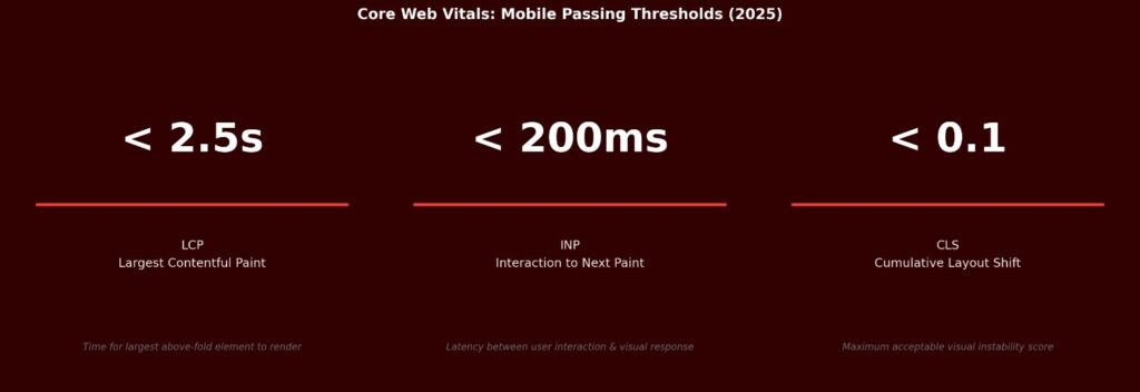
LCP: Largest Contentful Paint (target: under 2.5 seconds)
LCP measures how long it takes for the largest visible element above the fold to render.
On most sites, this is either a hero image or a large heading. The practical implication is that your most visually prominent above-the-fold element needs to be treated as a performance priority, not an aesthetic one.
The most common LCP failure pattern is a large, uncompressed hero image served at desktop resolution to mobile users. Converting hero images to WebP, serving appropriately sized versions using the srcset attribute, and preloading the hero resource in the document head are the three interventions that most reliably move LCP from failing to passing on mobile.
INP: Interaction to Next Paint (target: under 200 milliseconds)
INP replaced First Input Delay as a Core Web Vital in 2024 and measures the latency between any user interaction and the next visual response.
On mobile, where touch events and JavaScript event handlers can create significant delays, INP failures are common on sites built with heavy JavaScript frameworks or third-party script dependencies.
The diagnostic starting point is Google’s CrUX (Chrome User Experience Report) data, which shows real-user INP percentiles for your pages. Sites with INP failures almost always have excessive JavaScript execution on the main thread. Auditing third-party scripts, deferring non-critical JavaScript, and reducing event handler complexity are the interventions with the highest return.
CLS: Cumulative Layout Shift (target: under 0.1)
CLS measures visual instability: elements moving unexpectedly after the initial render.
On mobile, this typically manifests as content jumping when images without explicit dimensions load, when ad slots or cookie banners render, or when fonts swap from a fallback to the final typeface mid-render.
The fix for image-related CLS is simply specifying width and height attributes on all img elements so the browser reserves space before the image loads. For ads and dynamic content, reserving explicit space with min-height on containers prevents the layout from collapsing and then expanding. For font-related CLS, using font-display: optional or hosting fonts locally eliminates the swap that causes the shift.
The Technical Optimization Sequence That Produces Results
Technical mobile optimization has a sequencing problem: teams often invest in secondary improvements before addressing the primary causes of poor performance.
The table below reflects the priority order that consistently produces the most meaningful gains, based on how frequently each issue is the primary bottleneck versus a contributing factor.
| Priority | Action | What It Fixes |
| Critical | Audit and reduce JavaScript payload | Largest single performance gain for most sites |
| Critical | Minify CSS and JavaScript | Reduces file sizes without changing functionality |
| High | Preload above-the-fold resources | Ensures hero content renders before anything else |
| High | Host web fonts locally | Eliminates slow third-party font requests |
| High | Compress and convert images to WebP | Often cuts image payload by 30 to 50 percent |
| Medium | Implement server-side rendering for key pages | Dramatically improves time to first meaningful paint |
| Medium | Enable CDN for static assets | Reduces latency for geographically distributed users |
| Ongoing | Set aggressive caching headers | Near-instant loads for returning visitors |
JavaScript reduction consistently delivers the largest performance improvements for sites above a certain scale of frontend complexity. Every script that executes during page load competes for main thread resources that the browser needs to render content. Reducing script payload, deferring non-critical scripts, and eliminating scripts that are no longer actively used can move LCP and INP metrics more than any combination of other optimizations.
The practical audit workflow: run a Lighthouse audit in mobile simulation mode, export the JavaScript coverage report from Chrome DevTools, identify scripts consuming render-blocking time, and prioritize elimination over optimization where possible.
Removing a script entirely is always preferable to optimizing it.
Content Architecture for Mobile and AI Eligibility
Content structure on mobile is a different brief from content structure on desktop.
The reading behaviour is different: users scroll faster, skim more aggressively, and abandon long unbroken text blocks at much higher rates.
The optimization objective is clarity of information extraction, both for the human reader on a small screen and for the AI systems that evaluate content for Overview eligibility.
Structure That Serves Both the Reader and the Crawler
The content formats that perform best on mobile, and that AI systems extract most reliably, share a common characteristic: they make it easy to find a specific answer without reading everything. Short paragraphs, descriptive H2 and H3 headings, FAQ sections with direct answers, and structured comparisons all serve this goal.
A common mistake is treating mobile content as a condensed version of desktop content. That misses the point. Mobile content should be designed for information extraction from the start, not adapted from a desktop format. Headings should answer questions, not just introduce topics. Paragraphs should make one point before moving to the next. The structure should allow a reader to find what they need in any section without reading sequentially from the top.
Schema Markup and AI Overview Eligibility
Structured data helps Google’s systems classify and extract information from your pages with more confidence. For mobile-first contexts, the highest-value schema types are:
- FAQ schema (which directly feeds question-and-answer extraction for AI Overviews),
- Organization and LocalBusiness schema (which anchors entity recognition and local search visibility), and
- Product schema for e-commerce pages.
The connection between schema markup and AI Overview eligibility is not guaranteed, but it is well-documented as a contributing factor. Pages with FAQ schema that answer questions matching the query intent are disproportionately represented in AI Overview citations. The content within the FAQ markup needs to be genuinely useful and direct, not optimized for length or keyword density.
Voice and Visual Search: The Adjacent Opportunities
Voice search queries arrive with different linguistic patterns than typed queries: they are longer, more conversational, and almost always question-formatted.
Content that is structured in Q&A format, uses natural language, and provides direct sentence-level answers is better positioned for voice result selection.
Visual search through Google Lens is growing, particularly in product and retail contexts. Optimization for visual search is primarily an image quality and alt text problem.
Original, high-quality product photography with precise, descriptive alt text (“hand-thrown ceramic mug with matte blue glaze, 12oz” rather than “product image 47”), and structured product data gives Lens the signal it needs to match visual queries to your inventory.
What This Looks Like After Implementation
An e-commerce brand selling premium home products had 78 percent of traffic arriving on mobile, with a desktop LCP of 1.4 seconds and a mobile LCP of 5.8 seconds.
The gap was almost entirely explained by hero images being served at desktop resolution without mobile-specific srcset attributes, combined with three third-party analytics scripts loading synchronously in the document head.
The intervention was targeted:
- hero images converted to WebP with mobile-specific srcset,
- analytics scripts moved to deferred loading, and
- explicit dimensions added to all images to resolve CLS.
No redesign, no architectural changes.
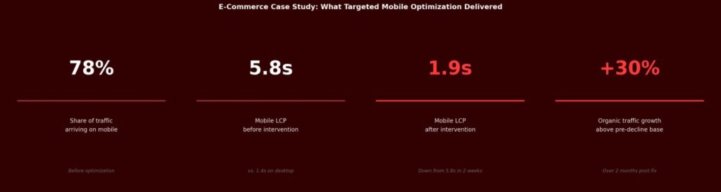
Mobile LCP dropped from 5.8 seconds to 1.9 seconds within two weeks of deployment.
Organic traffic recovered from a 40 percent decline that had coincided with a Core Web Vitals update, and grew approximately 30 percent above the pre-decline baseline over the following two months.
The lesson is not that these optimizations are miraculous.
It is that the gap between desktop performance and mobile performance is frequently large enough to cause a material ranking impact, and the interventions that close it are often more contained than teams expect.
Mobile UX: The Elements That Determine Conversion, Not Just Ranking
Technical performance is the foundation. User experience, on top of that, determines whether mobile visitors convert. The two problems are related but require different diagnostic approaches.
Navigation and Interaction Design
Mobile navigation fails in predictable ways.
- Menus designed for mouse hover interactions do not translate to touch.
- Tap targets smaller than 48 by 48 pixels create precision errors that frustrate users and drive abandonment.
- Navigation placed at the top of the screen requires thumb extension that creates physical friction, particularly on larger phone formats.
The practical benchmark is to test your site’s key navigation flows on actual devices, not browser simulation, and map where thumb reach becomes uncomfortable. Bottom navigation bars, sticky CTAs that remain accessible while scrolling, and simplified menu structures with no more than five or six primary items are the design patterns that consistently reduce friction on mobile.
E-commerce Conversion on Mobile
Mobile commerce conversion rates lag desktop conversion rates on most sites, and the gap is almost always attributable to checkout friction rather than intent differences.
Mobile users who have reached the checkout stage have already made the purchase decision. The cart abandonment that happens there is a UX failure, not a demand problem.
The highest-impact checkout optimizations are:
- enabling digital wallet payments (Apple Pay, Google Pay) that eliminate manual card entry,
- supporting guest checkout without forced account creation,
- pre-filling address and payment fields where browser autofill is available, and
- ensuring that the payment confirmation step loads reliably on cellular networks.
Each of these reduces the number of deliberate actions required to complete a purchase.
If you want to know specifically where your mobile performance is losing ranking potential or conversion volume, a focused mobile audit surfaces both. Request a mobile SEO and UX teardown.
Local SEO and the Mobile Intent Intersection
Local search intent is predominantly mobile.
Queries that include “near me,” “open now,” or a specific neighbourhood are almost universally generated by someone on a phone, often in motion. The optimization priorities for this segment are different from general mobile SEO.
Google Business Profile completeness is the highest-return local mobile optimization. A profile with current hours, high-quality images, active Q&A responses, and consistent review engagement generates significantly more clicks from local mobile queries than an incomplete or stale profile. The optimization is not technical; it is operational: someone needs to own the profile and maintain it.
NAP consistency across directories, accurate LocalBusiness schema on the website, and mobile CTAs that trigger direct phone calls or navigation actions (rather than requiring the user to manually copy a phone number or address) are the next tier of local mobile optimization.
These are straightforward implementations with measurable impact on click-through from local results.
Building a Maintenance Process, Not Just a One-Time Fix
Mobile SEO performance degrades over time without active maintenance.
- New pages are added without mobile testing.
- Third-party scripts accumulate as marketing tools are integrated.
- Template changes introduce CLS regressions.
- Core Web Vitals thresholds tighten as Google’s quality standards evolve.
The brands that sustain mobile SEO performance have operational processes, not one-time projects.
The minimum viable process is: weekly monitoring of Search Console’s Core Web Vitals report, monthly Lighthouse audits on the highest-traffic pages, and a pre-deployment mobile test requirement for any significant template or content changes.
Search Console’s mobile usability report surfaces crawl and rendering issues as they appear in production. Google’s PageSpeed Insights API can be automated to run scheduled audits and flag regressions before they compound into ranking problems.
Neither requires significant investment. Both require someone to own them.
2025 Mobile SEO Checklist
The checklist below consolidates the priority areas covered in this article into an auditable format. Use it to identify gaps, prioritize fixes, and track progress over time.
| Design & Structure |
| Responsive layout across all viewport sizes |
| Clear visual hierarchy with mobile-native font sizes (min 16px) |
| Thumb-friendly navigation placement |
| Strong above-the-fold content within 1.8s load |
| Speed & Performance |
| Images compressed and served in WebP format |
| CSS and JavaScript minified |
| Lazy loading enabled for below-fold images |
| Critical resources preloaded |
| CDN enabled for static assets |
| Content Architecture |
| Short paragraphs (2 to 3 lines maximum) |
| FAQ sections with schema markup |
| Structured headings for AI Overview eligibility |
| Conversational tone matched to mobile intent patterns |
| Technical SEO |
| Core Web Vitals passing (LCP under 2.5s, INP under 200ms, CLS under 0.1) |
| Mobile crawlability confirmed in Search Console |
| Canonical tags and XML sitemap in order |
| Robots.txt verified |
| User Experience |
| Tap targets minimum 48x48px |
| Prominent CTAs accessible without scrolling |
| Pop-ups are dismissible and do not block content |
| Checkout flow optimized for mobile wallets and guest checkout |
| Local & E-commerce |
| Google Business Profile updated with current hours, images, Q&A |
| Local schema markup implemented |
| NAP is consistent across all directories |
| Product pages load under 2 seconds on 4G |
Get a Clear Picture of Where Your Mobile SEO Is Losing Ground
Most mobile SEO gaps are not visible in standard analytics. They show up in Core Web Vitals field data, Search Console coverage reports, and the behavioural metrics of mobile visitors compared to desktop. A structured mobile audit identifies the specific issues costing you ranking and conversion, and prioritizes the fixes that will have the most commercial impact. If your mobile performance feels like a known problem without a clear remediation path, that is the right starting point for a conversation.
→ Request a mobile SEO audit and prioritized action plan